BACK
Nefros Redesign
Improving access to kidney health research and resources through information architecture redesign.

Healthcare
Information Architecture
Research
Company
UHN
Role
Lead UX Designer
Timeline
2023
Product
Nefros
Executive Summary
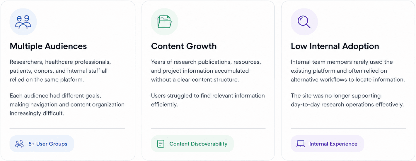
Nefros serves researchers, healthcare professionals, patients, and internal staff.
As the website evolved over time, content became fragmented, navigation grew increasingly complex, and users struggled to find relevant information.
I led a redesign initiative focused on improving information architecture, content discoverability, and overall usability across both external and internal experiences.
Business challenge
Complex audiences, fragmented content, and declining usability
As the Nefros platform evolved, content expanded across multiple user groups and workflows. The challenge was not simply redesigning a website, but creating a clearer information architecture that could support both external visitors and internal research teams.
Research & Discovery
I used a mixed-methods approach to understand user needs, evaluate the existing experience, and uncover the root causes behind navigation and usability.

FINdings
Finding 01
Users struggled to locate research content and resources efficiently.
Finding 02
Internal team members avoided using the internal platform due to poor organization and discoverability.
Finding 03
The homepage lacked clear prioritization and failed to communicate the mission of the organization effectively.
Finding 04
Donation and participation opportunities were difficult to discover.
Design strategy
Rather than focusing solely on visual redesign, the project prioritized information architecture, content hierarchy, and audience-specific pathways.

Solutions
Solution 01
Homepage Redesign - Before (Left) vs After (Right)
Reframing the homepage from a content-heavy repository into a clear orientation layer for KHERG’s diverse audiences.


Design decisions
01 — Navigation
Make high-priority actions easier to find
The previous navigation gave similar visual weight to every destination, making key actions easy to overlook. I elevated “Donate to support our research” as the primary CTA, added “Team Login” as a distinct utility action, and reorganized the navigation around clearer audience needs.
Why:
Reduce decision friction and make donation, internal access, and core content easier to identify at a glance.

02 — First Screen
Clarify what KHERG does before users scroll
The previous hero promoted individual initiatives without clearly explaining the organization or surfacing its current work. I introduced a flexible banner for active studies and placed “Our Mission” immediately below it.
Why:
Give first-time visitors immediate context about who KHERG is, what it does, and what is happening now—instead of asking them to infer the purpose of the site from scattered content.

03 — Research
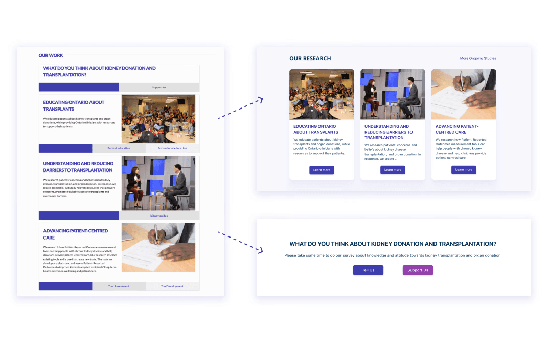
Separate research content from participation actions
The previous homepage mixed educational research content, transplant surveys, and donation entry points within the same section. I reorganized the area into a dedicated “Our Research” section, while separating participation into clearer survey and support pathways.
Why:
These actions represent different user intents. Separating them creates a clearer content hierarchy and helps users understand whether they are there to learn, participate, or support.
04 — Recent Publications
Turn a dense publication list into scannable content
The original homepage presented publications as a long text-heavy list, requiring users to scan large amounts of information before finding something relevant. I surfaced recent publications as individual cards and added a clear path to browse the full collection.
Why:
Use progressive disclosure to prioritize recent content while keeping deeper research accessible without overwhelming the homepage.

05 — News & Events
Create a clearer distinction between what’s current and what’s past
I redesigned News & Events to highlight the latest update first, while keeping previous items visible in a secondary list and providing access to the full archive.
Why:
Help returning visitors quickly understand what’s new, without forcing them to scan equally weighted content.

06 — Footer
Turn the footer into a secondary navigation system
The previous footer contained a large number of links with limited hierarchy. I regrouped destinations according to the revised information architecture and surfaced essential resources and contact points more clearly.
Why:
Give users a reliable second route to important content—especially on a multi-audience, content-heavy healthcare website.

Solution 02
Information Architecture Overhaul
Restructuring the site around clearer content relationships and user mental models.
The existing information architecture had duplicated content, unclear parent–child relationships, and overlapping navigation paths, making it difficult for users to understand where information belonged.
I reorganized the structure so parent sections functioned as clear navigational entry points, consolidated duplicated content, and grouped related resources under more intuitive categories.
The goal was to reduce ambiguity and help users build a clearer mental model of the site.

Before
Duplicated content
Overlapping categories
Unclear hierarchy
After
Clear parent–child structure
Consolidated content
More predictable navigation
Solution 03
Internal Dashboard Redesign
Creating a centralized starting point for internal research workflows.
Internal staff often relied on supervisors or scattered resources to find information because the existing internal experience lacked a clear starting point.
I redesigned the dashboard as a centralized workspace, bringing together announcements, publications, team resources, logs, and frequently used internal tools in one place.
The goal was to reduce dependency on informal knowledge-sharing and help staff access day-to-day information more independently.
Centralized access - Brought frequently used internal resources into one predictable starting point.
Clear content hierarchy - Prioritized announcements, publications, and team resources based on day-to-day usage.
Faster internal navigation - Added clearer access to profile, team directory, logs, and supporting materials.
Impact
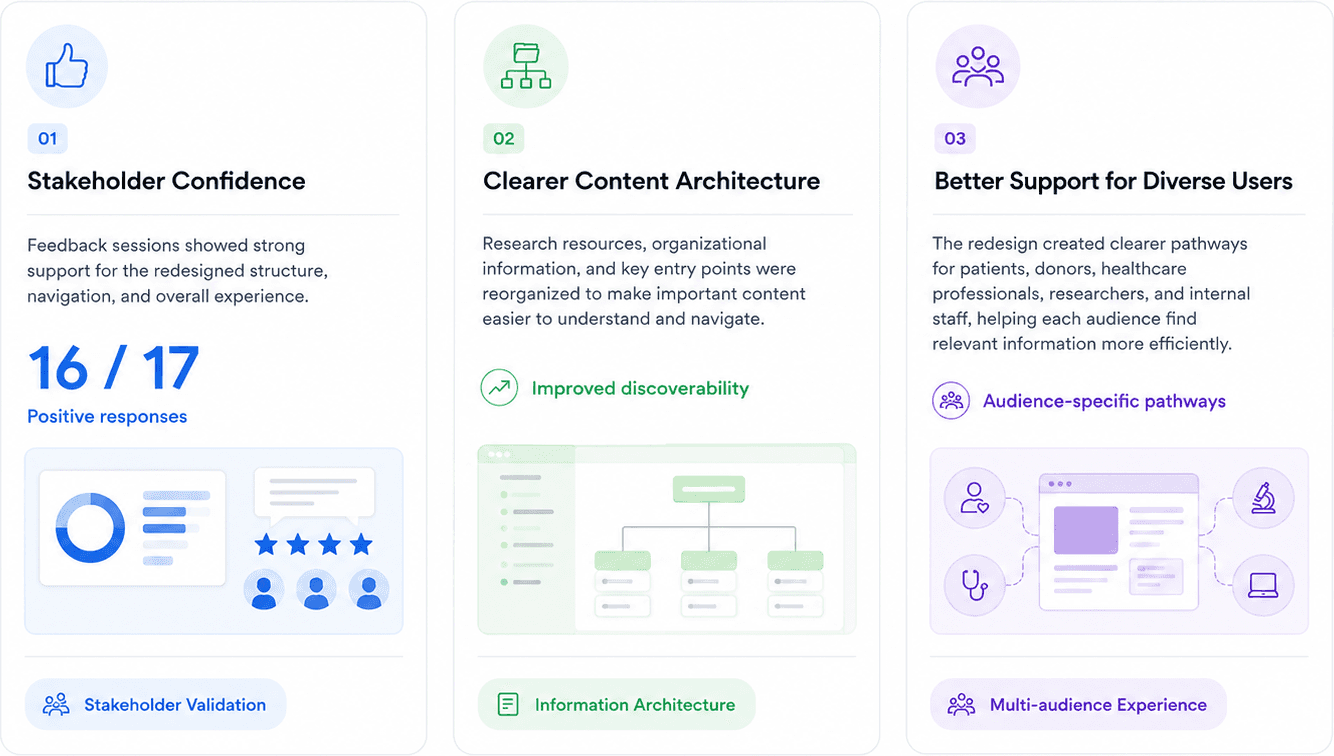
The redesign improved content discoverability, clarified information architecture, and created a more usable experience for both external visitors and internal research teams.
Reflection
This project reinforced the importance of information architecture as a foundation for user experience.
While visual design can improve first impressions, users ultimately judge a product by how easily they can find information and accomplish their goals.
The redesign demonstrated how thoughtful content organization and stakeholder collaboration can create meaningful improvements across diverse user groups.
More


